UX Research & Discovery
User interviews, task analysis and journey mapping to establish what the interface actually has to solve before anyone opens a design tool.
Research-led interface design for products people have to use every day, not just look at once.
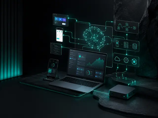
Most design briefs arrive describing a visual problem. The site looks dated, the app feels clunky. Underneath, the actual problem is usually structural. Nobody established what users were trying to accomplish, so the interface organises information the way the business is organised internally.
We start with the job the user came to do. Research, flows and wireframes come before any visual direction, and we test the structure with real users before it becomes expensive to change.
The output is a design system your developers can build against, not a set of static screens that leaves every edge case to be improvised in code.
A paid discovery phase producing a scoped roadmap you own outright.
Data model, integrations and infrastructure agreed before code.
Fortnightly demos, working software, no black box.
Your repositories, your infrastructure, documented.
User interviews, task analysis and journey mapping to establish what the interface actually has to solve before anyone opens a design tool.
Interactive prototypes tested with real users while changes are still cheap, rather than after development has committed to them.
Visual design for web and mobile that follows platform conventions where it should and departs from them only with a reason.
Component libraries, tokens and documentation so the tenth screen is consistent with the first and developers stop guessing.
Funnel analysis and structured testing on the pages that carry revenue, using analytics rather than opinion to decide what changes.
WCAG-informed design, contrast, focus order, touch targets and screen-reader structure, built in rather than audited in afterwards.
Interviews, usage data and task analysis with real users in Kerala, not assumptions from a conference room.
The structure of the product decided before visual design, reviewed with the people who will use it.
Tested with users on the devices they own before a line of code is written.
Components, tokens and patterns documented so the product stays consistent as it grows.
Screens that survive Malayalam strings, which run longer than English and need different type.
Contrast, touch targets and screen reader support built in.
Specifications, assets and a component library engineers can build from without guessing.
The events and funnels that will tell you whether the design worked.
| Engagement | Timeline |
|---|---|
| UX audit of an existing product | 1 to 2 weeks |
| Research and product definition | 2 to 4 weeks |
| App or web product design | 4 to 10 weeks |
| Design system | 3 to 6 weeks |
| Ongoing product design | Monthly |
Infopark and KSUM-backed products that need a designed experience before the next round.
Patient and clinician interfaces where clarity and error prevention matter.
Flows where trust, speed and regulatory disclosure have to coexist.
ERP, CRM and operations screens that staff use for hours a day.
Products for a Kerala audience on mid-range Android in Malayalam and English.
Research, design and handoff for a defined product or release.
A designer working inside your product team month to month.
Design carried through to engineering by the same team.
Most product decisions in Kochi startups and businesses are made by the loudest person in the room. Research replaces that with evidence: what users are trying to do, where they fail, what they say and what they actually do. It does not need to be slow. A week of interviews and usage data changes what gets built.
We run research with real users in the market the product serves, in Malayalam where that is their language, on the devices they own, and we turn it into decisions rather than a report nobody reads.
Structured conversations with the people who use or will use the product.
Analytics and session recordings where the product exists.
What users are trying to do, step by step, and where it breaks.
Findings turned into a prioritised list of what to change.
A product for a Kerala audience is used on a mid-range Android phone, often in Malayalam, often on a poor network. Malayalam strings run longer and need different type. Touch targets, contrast and loading states matter more when the phone and the network are ordinary. Designs made on a large monitor for an English-speaking user break on contact with that reality.
We design for the actual device and language from the first wireframe and test prototypes on real phones with real users.
Screens designed and tested with Malayalam content.
Prototypes tested on mid-range Android and iPhones.
Designed, not left to the engineer to improvise.
Contrast, touch targets and screen readers handled.
Design that stops at a Figma file is half a product. The handoff has to give engineers specifications, assets and a component library they can build from without guessing, and the designer has to stay involved as the build reveals what the design missed.
Because Infynix builds software as well as designing it, design and engineering are one team when the client wants them to be, and the design system becomes a code library rather than a document.
Everything engineers need, organised.
A design system that becomes code.
The designer stays involved through the build.
Events and funnels that show whether the design worked.
The most neglected interfaces in any Kochi business are the ones staff use for hours a day: the billing screen, the inventory form, the CRM. They were never designed, only built, and the cost shows up as errors, training time and workarounds. Designing them properly is often the highest-return design work a business can buy, because the users are captive and the volume is enormous.
We design internal tools with the same rigour as consumer products: observing the work, mapping the tasks, reducing steps, and testing with the people who will use them, in Malayalam where that is their language.
Watching the work as it is done, not as it is described.
Removing clicks, fields and screens from the tasks done most.
Designing so mistakes are hard to make and easy to undo.
Prototypes tried by the people who will live in them.
Design decisions made on a large monitor consistently fail in Kerala, where most users arrive on a mid-range Android phone over mobile data. Dense tables, hover-dependent interactions and hairline typography all look considered in a review and become unusable in the hand.
We design mobile-first as a working method rather than a slogan, prototype on real devices, and set a performance budget alongside the visual direction so the two are not in conflict later.
Every engagement is scoped individually after a discovery session, from the outcome you need and the work involved, and quoted before anything starts. Ad spend, where it applies, is separate and paid directly to the platforms, and we will say plainly if the budget on the table is too small to produce a usable result.
Yes. We deliver research, prototypes and a documented design system your own or another team can build from. We would rather hand over something implementable than something that looks impressive and leaves the hard decisions to developers.
Yes, and it matters more than teams expect. Assumptions about digital literacy, language preference and payment behaviour that hold in Bangalore or Dubai often do not hold for a Kochi or Malabar audience. We recruit and test locally.
Visual design changes how something looks; UX changes what it does and in what order. Most products we are asked to make prettier are actually organised around the company’s internal structure rather than the user’s task, restructuring that produces far more improvement than restyling.
Usually yes, and it is often the best-value engagement available. We analyse funnel drop-off in your analytics, identify where users abandon, and test structured changes rather than redesigning wholesale on a hunch.
Yes. Prototypes are tested with real users in the market the product serves, on the devices they own, in Malayalam where that is their language, before engineering begins.
Yes. Layouts are designed and tested with Malayalam content, which runs longer than English and needs different typography, so the product works in both languages.
Yes, where the client wants one team. Infynix builds web and mobile software, so design carries through to engineering without a handoff gap.
A one to two week review of an existing product against usage data, heuristics and user tasks, producing a prioritised list of what to fix and why. It is the fastest way to find out where a product is losing users.
Scope drives the number, so the honest answer comes after a short discovery rather than before it. What we commit to in advance is that the quote is fixed for the agreed scope, that there are no surprise extras, and that we tell you when a cheaper route would serve you better.
Yes, and it is often the highest-return design work a business can buy. Billing, inventory and CRM screens used all day are designed from task observation, with fewer steps and error prevention, and tested with the staff who use them.
Tell us what you are trying to grow and we will tell you honestly whether we are the right people for it.
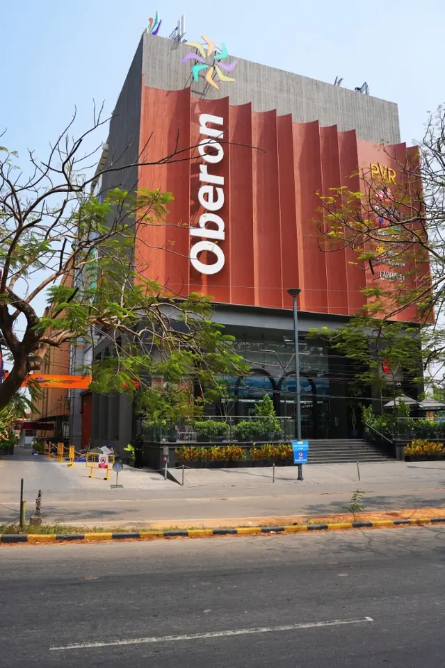
3rd Floor, Oberon Mall, Padivattom, Edappally, Kochi, Kerala 682024